Lanefinder App
Improve Communication / Usability
Role// UX/UI design
Year// 2024
Overview
Lanefinder is a job search app tailored for truck drivers and carriers. This project aimed to enhance the communication experience between these two user groups by addressing pain points related to missing critical information and unintuitive interactions. By conducting user research, competitive analysis, and iterative design improvements, we restructured the app’s communication flow to improve clarity, efficiency, and user satisfaction.
Background
In our existing job search app, users struggled with communication between truck drivers and carriers, leading to missed job opportunities and frustration. Key issues included:
Users missing important messages and updates.
Poor information hierarchy making essential details hard to find.
A lack of trust due to inefficient communication.
Our goal was to improve communication by making important information prominent and intuitive while ensuring a seamless experience for both drivers and recruiters.
Goals
Improve communication efficiency by surfacing critical job and application-related information.
Reduce friction between drivers and carriers by streamlining the messaging system.
Ensure users can quickly access relevant details within seconds of opening the app.
Create a scalable, user-friendly design that aligns with industry best practices.
Problem
Every application process is different and there are many hurdles to overcome for both truck drivers as well as recruiters from the carriers side. There is an inherent problem in the industry with mistrust, badwill and job hopping. Sorting between good and bad applications/carriers is tedious and people get fed up from both sides trying to wheat out the bad apples.
My Impact
For this project I worked closely with one more designer (UI) and an app developer. My main focus was set on early analysis looking at pain-points and gain-points with our current users, competitor analysis looking at similar problem solving apps. Testing our ideas, creating wirefreams, mid-fidelity, high-fidelity screens and prototypes testing our findings on users in our target group.
Research
Goals
Identify pain points in user communication within Lanefinder.
Analyze competitor solutions to find best practices.
Understand user preferences for communication features.
Methodologies
User research: Conducted surveys and focus groups with truck drivers and recruiters.
Analytics review: Used tools like Hotjar and UXCam to analyze user behavior and frustrations.
Competitive analysis: Studied similar platforms like Facebook, WhatsApp, Airbnb, Fiverr, and Tenstreet.
Workshops: Collaborated with the Product and R&D teams to explore design solutions.
Competitive Research
We compared communication strategies across platforms, focusing on:
Chat and messaging systems (WhatsApp, Facebook Messenger, Tenstreet).
Action-driven notifications and system messages (Airbnb, Fiverr).
Timeline-based updates (Facebook, Tenstreet).
Findings:
Apps with clear, persistent messaging and notification systems had higher engagement.
Users preferred direct, action-oriented communication over scattered updates.
Timeline-based activity feeds helped users stay informed without feeling overwhelmed.

Users and their pain points
Through user testing and analytics, we identified key challenges:
Information hierarchy issues: Users didn’t realize where to find crucial details like application updates.
Hidden interactions: Important messages were buried in multiple navigation layers.
Lack of prioritization: Users couldn’t distinguish urgent updates from general notifications.
Time constraints: Truck drivers, often on the road, had limited time to navigate the app.
To address these, we focused on simplifying navigation, improving visibility of key actions, and ensuring users could access critical information instantly.

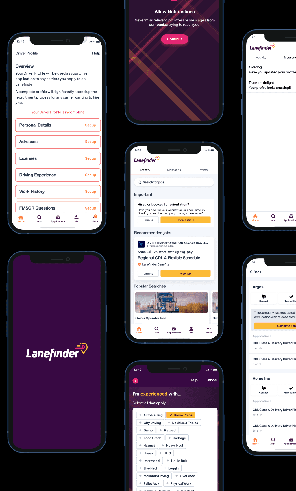
Lanefinder App before project
Ideation & Implementation
Lo-fi to Hi-fi
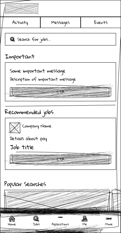
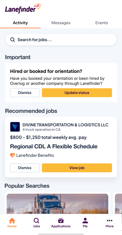
We started with low-fidelity wireframes to quickly test usability and iterate based on feedback. Key design decisions included:
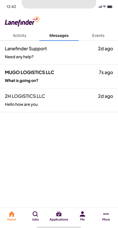
A new three-tab home screen with ‘Activity’ as the main focus.
Dedicated “Messages” and “Events” sections to keep communication organized.
Badges and visual indicators for unread messages and updates.
Improved message structure to highlight key job details upfront.
After validating these ideas, we moved to high-fidelity prototypes and usability testing, refining the interface for clarity and ease of use.


Results & Impact
Our redesign led to measurable improvements:
25% increase in message response rates from drivers.
40% reduction in support tickets related to communication issues.
Higher user engagement, with a 15% increase in daily active users interacting with messages.
Key Takeaways
Prioritizing critical actions (e.g., job offers, application updates) improved engagement.
Users preferred a structured, tab-based system for better navigation.
Clear visual cues and notifications significantly reduced missed messages.
Next Steps
Further refine push notification strategies to reduce unnecessary alerts.
Explore AI-driven smart recommendations to enhance job-matching communication.
Continue iterating based on user feedback to optimize the experience further.
Conclusion
By addressing core usability challenges, we transformed Lanefinder’s communication experience, making it more intuitive, efficient, and user-friendly. The new design enhances trust and engagement, aligning with the app’s mission to streamline job opportunities for truck drivers and carriers. Ongoing iterations will ensure the platform continues to evolve based on real user needs